Blackfriars, Oxford
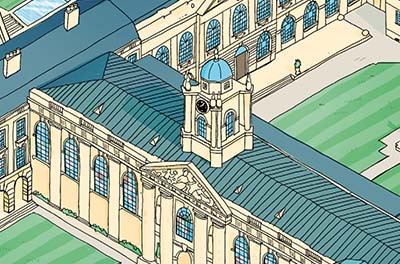
Blackfriars is a ‘Priory’, the home of a community of Dominican Friars who open their doors to others, welcoming university students, researchers, men training for priesthood – and many local people who attend religious services and social events.
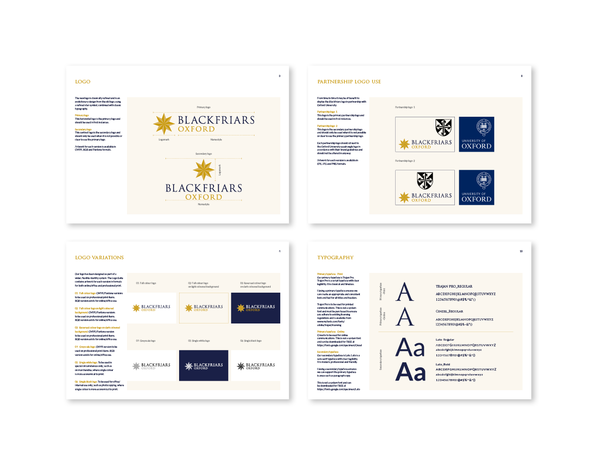
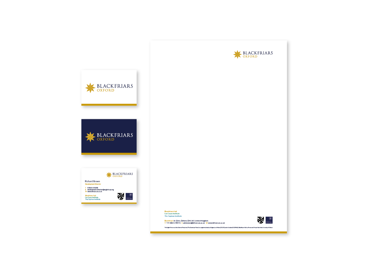
The old logo featured the Dominican shield, along with a namestyle - in a standard serif font. But using this shield as part of the Blackfriars logo was not distinctive enough. The new identity still includes this shield as a separate devise - but as a secondary symbol.
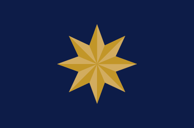
Various versions of a star feature in and around the college, from the front gate, to the chapel and elsewhere. It was therefore a natural solution for the symbol. The carved 3D star in the chapel was the version we adopted for the symbol as it was the most interesting and distinctive design.
The typeface for the namestyle, Trajan, had already been chosen and used for a few interim print items produced - so we therefore agreed to retain this.
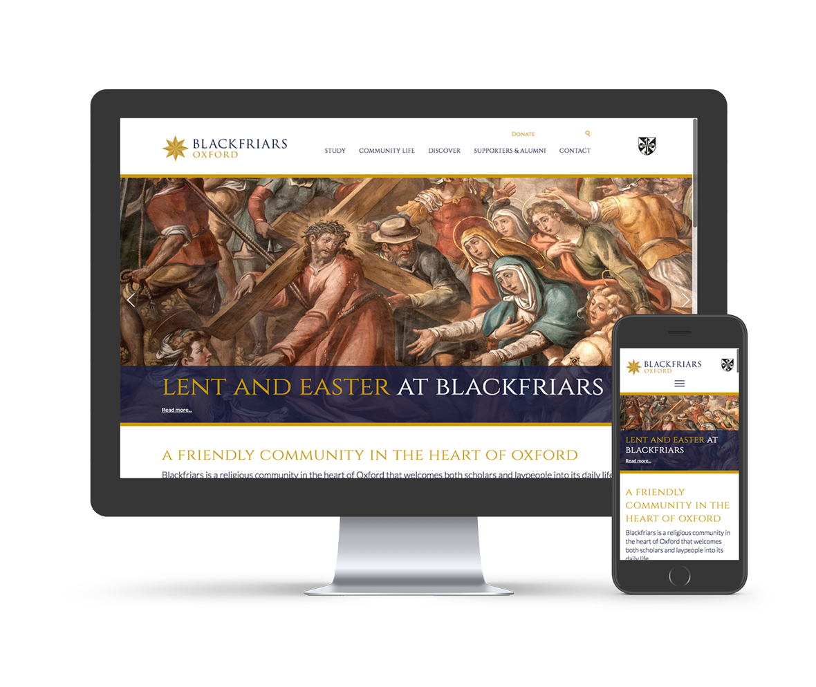
The colours and typeface used for the new logo were then used as a basis for the design of the website which is classic in feel but open / accessible and modern.
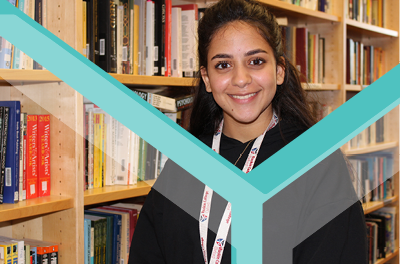
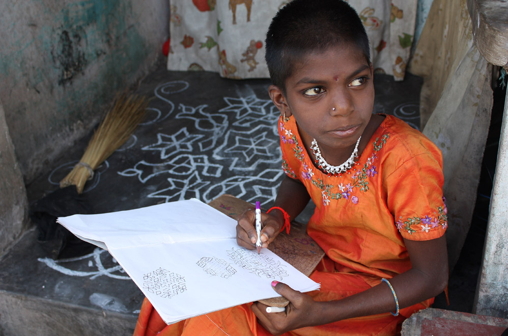
The site was designed to accommodate the three different sets of audiences. Clear signposting to find immediately what each set require, was a priority: - such as service times for local people, relevant research for trainee priests and for students to find out about studying at Blackfriars. Strong photography and imagery is used throughout especially for feature boxes enabling a visual way into various parts of the site.
